
Over the last couple of weeks, the number of cases of coronavirus have been on the rise in the US. This is causing yet another panic, with threats of increased and/or reinstated lockdowns around the country, as well as a fresh round of mask-shaming.
As a scientist, I always want to know what is actually going on. Here is the data for the increase in cases in the US (data from https://www.worldometers.info/coronavirus/country/us/):
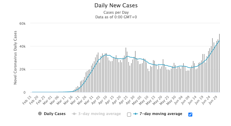
Definitely ominous looking. Four months ago when the pandemic started in the US along with the lockdowns, I predicted this would happen based on looking at the data from the 1918 pandemic (see https://www.nationalgeographic.com/history/2020/03/how-cities-flattened-curve-1918-spanish-flu-pandemic-coronavirus/). Those cities that shutdown the fastest appeared to invariably have a second (and even third) spike in cases.
This is a great illustration of how the morphing of the shutdown from “slowing the progression of the infection so hospitals can handle the cases” to “stay home until the virus goes away” is so wrong. Slowing progression, particularly if it is focused on the most vulnerable populations, makes a lot of sense. Naively thinking that we can make the virus go away by locking ourselves in our houses is hubris.
What is the real impact of what is going on right now? If you look at the total number of cases of the virus you have the following data:
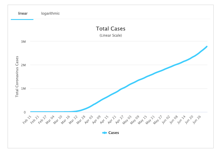
Obviously, since this is counting total cases, it cannot go down. It has a fairly linear increase over time with a slight increase in the slope with the new cases.
A much better indicator of the real problem is to not look at the number of cases, but at the number of deaths (worst possible outcome). Here is the data for that:
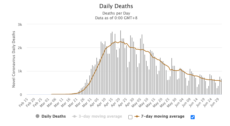
Deaths do not appear to be increasing… Some might argue that we need to wait a little longer and then we will see an increase in deaths, as there is a lag between the onset of cases and the eventual death. For the majority of the pandemic, the death curve has been lagging behind the case curve by roughly 1 week (compare the dates to key features such as onset and peak of this curve and the original curve). That would put an increase in the death rate occurring around June 21st, which is definitely not seen.
Interestingly, it is very difficult to find the death rate data on the CDC website anymore. It used to be readily available but no longer is. What’s up with that?
What is actually going on with the increase in cases? Is it the careless millennials going to bars (leading to them being shutdown again), the selfish boomers refusing to wear masks (leading to even stricter orders for mask wear), or something else? I’m going to go with the third option. Looking at data of testing going on we see the following (from https://coronavirusbellcurve.com/):
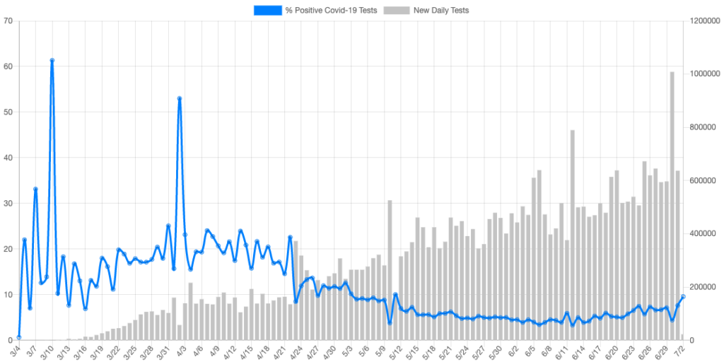
We are ever increasing the amount of daily testing going on, contrary to the narrative that the government is preventing testing, and with more testing will come more cases. The more interesting curve above is the blue one. That is the percentage of tests that are coming back positive. in the beginning the percentage was high, because only people who were sick were being tested. While current percentages are increasing a little, they are still less than they were at the beginning of March.
Conclusion: the increase in number of coronavirus cases is merely due to the increase in testing being performed. Deaths continue to decline, at least at this moment.